Creating components – Components and Pages-1
The main building blocks of an Angular application are the components. It is by using them that we assemble our user interfaces and define the flow of the experience. In Angular architecture, components organize an application into reusable parts, making it easy to maintain and scale.
In this chapter, we will explore the communication between components and thus assemble our pages using component composition, avoiding the anti-pattern of creating monolithic interfaces.
In this chapter, we’re going to cover the following topics:
- Creating components
- Communication between components – inputs and outputs
- Best practice – using the TrackBy property
- Separating responsibilities – smart and presentation components
- Communication from the child component – using @Output
By the end of this chapter, you will be able to create reusable and easy-to-maintain components and pages, streamlining the development of your project and increasing your productivity and that of your team.
Technical requirements
To follow the instructions in this chapter, you’ll need the following:
- Visual Studio Code (https://code.visualstudio.com/Download)
- Node.js 18 or higher (https://nodejs.org/en/download/)
The code files for this chapter are available at https://github.com/PacktPublishing/Angular-Design-Patterns-and-Best-Practices/tree/main/ch4.
Creating components
Every interface created with Angular is a component in the architecture of the framework; therefore, theoretically, we could have our entire application in a single component.
As we studied in Chapter 2, Organizing Your Application, it is best to separate your application into modules, and with components, we use the same reasoning by separating our interfaces into and composing them with different components, maximizing reuse and maintainability.
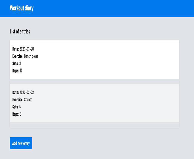
In this chapter, we will illustrate this with a gym diary application, as shown in the following figure – to focus on Angular, we will not use Angular Material, only HTML, CSS (in this case, Tailwind CSS), and TypeScript.

Figure 4.1 – Gym diary application UI
In this initial example, we created a component with just the HTML template and the CSS and TypeScript files are as they were created by Angular CLI. Here’s the top of the page first:
<div class=”min-h-screen bg-gray-200″>
<header class=”bg-blue-500 py-4 text-white”>
<div class=”mx-auto max-w-6xl px-4″>
<h1 class=”text-2xl font-bold”>Workout diary</h1>
</div>
</header>
Using good HTML semantic practices, let’s create a main section:
<main class=”mx-auto mt-8 max-w-6xl px-4″>
<section class=”mb-8″>
<h2 class=”mb-4 text-xl font-bold”>List of entries</h2>
<ul class=”rounded border shadow”>
<li class=”mb-4 border-b bg-white p-4″>
<span class=”font-bold”>Date:</span> 2023-03-20<br />
<span class=”font-bold”>Exercise:</span> Bench press<br />
<span class=”font-bold”>Sets:</span> 3<br />
<span class=”font-bold”>Reps:</span> 10
</li>
<!– more entries here –>
</ul>
</section>
<button
class=”rounded bg-blue-500 py-2 px-4 font-bold text-white hover:bg-blue-700″
>
Add new entry
</button>
</main>
</div>
We can see that in the preceding example, the interface is designed and stylized, but it is not functional because the diary entries are fixed in HTML, and in our application, the user should be able to add as many entries as they want.
We can identify here that this part of the diary entry could be a component for the page to use, so let’s create a component called entry. As we learned in Chapter 1, Starting Projects the Right Way, we are going to use the Angular CLI to create this new component in the module we need:
ng g c diary/entry-item